Thursday, December 8, 2011
Wednesday, November 30, 2011
Summary of Paula Scher
Paula Scher is an internationally known and respected designer and artist. She was born October 6, 1948 in Washington D.C. and currently resides in New York City. She moved there after graduating from Tyler School of Art in Elkins, PA in 1970 with a BFA. Scher has taught at various art schools including School of Visual Arts in New York and Tyler School of Arts after receiving her Doctorate of Fine Arts from Corcoran College of Art & Design.
Scher's most well known designs are logos and packaging from companies like Citi bank, Tiffany & co., Target, and many others. Her designs include work in identity design, packaging design, publication design, and environmental graphics.
Her current personal artwork is a painting series started in the early 1990's and is based on topological maps which are skewed to her point of view of that place. These maps comment on our world of information overload in a deeply personal way.
Quotes from Paula Scher about her art:
"My paintings are personal, overt, admitting skewing of information."
"I didn't stop being a graphic designer to become a painter. One informs the other and I am richer for both."
Tuesday, November 29, 2011
Friday, November 18, 2011
CSS Basics
Chapter 1: Introduction to CSS
This chapter talks about the different ways to use CSS coding. There is both internal stylesheets (coded inside the <head> tag in html), and external stylesheets (coded in a separate CSS file). There is also inline styles that define the style of specific text, but it would take a long time to use inline styles (coded inside HTML) on all text, and is especially inefficient if the text will have the same style.
Chapter 2: CSS Syntax
This chapter is about how CSS code is written. There is a selector and a declaration. Within the declaration is the property and value. You can combine selectors if multiple types of text are going to have the same style. Comment tags can be used to explain to others who may be looking at your code, why you wrote what you wrote.
Chapter 3: CSS Classes
CSS classes are used to change the style of a specific word or phrase in your CSS file.
Chapter 4: CSS ID’s
ID’s are similar to classes, except once a specific id has been declared it cannot be used again within the same HTML file.
Monday, November 14, 2011
Creating a Resume using HTML coding
I used a lot of lists to organize my resume into a readable format. This is the result.
This is the code that I wrote for my resume.
Thursday, November 10, 2011
Monday, November 7, 2011
Thursday, November 3, 2011
Magazine Cover in Progress
First I merged my captured image with my scanned image using layers and masks. I didn't want an unrealistic, flat background, so I played with the opacity so that some of the original background still showed through.
Next I added a Gaussian Blur to the whole photo after flattening it and saving it in another file name. I created a gradient of blur so that the cupcakes up front are in focus, but the ones in the back are not. This will also make it easier to read the type in the masthead.
Next I placed the image into InDesign and added my masthead to the image, changing the colors to work with my image.
Next changes were made to the Masthead to make it more legible.
An illustration was added for the "Zombie Cupcakes"
Colors were altered to be more legible.
"Blood" was added to the cupcakes as an illustration in illustrator and then merged to the background image in photoshop.
Text was added for the featured stories.
The stories were moved around to find the most aesthetically pleasing and legible design.
Tuesday, November 1, 2011
Wednesday, October 26, 2011
Monday, October 24, 2011
Mood Board for Magazine Cover
Questions to Answer About Magazine Cover:
- Who is the target audience?
- College students and young adults who like to bake
- What is the name of your magazine? Why? Connotations?
- College Baking: treat yourself and your friends
- What will your masthead look like? Do you have any ideas for fonts?
- College Baking will be large with a smaller tagline of "treat yourself and your friends"
- Fonts - something simple and clean - sans-serif
- What images will be on the cover and why?
- Fall Themed desserts to take to Halloween parties - because it will be a Halloween/Fall themed issue
- What will be your sell lines to entice your target audience?
- Be Resourceful - what to use if you don't have the tools you need
- Collaborate - share ingredients with roommates or neighbors
- Crock Pot Cakes - no oven, no problem
- Ghoulish [Trick or] Treats - impress your friends at Halloween parties with these recipes
Thursday, October 20, 2011
Mind Map for Magazine Cover
The string of thoughts that I found most interesting was baking. I'm thinking of this time of the year, fall, I really bake a lot and the whole house is filled with smells of spices and sweets. Maybe I can also take another spin on baking, like baking in the college years or something like that to set my magazine apart from the ones that are already out there.
Wednesday, October 19, 2011
Sunday, October 16, 2011
Thursday, October 6, 2011
Tuesday, October 4, 2011
Sunday, October 2, 2011
Saturday, October 1, 2011
Second Seed Packet (Mother of Pearl)
beginnings of design on second seed packet
Continual development of second seed packet
further editing
finished design
Thursday, September 29, 2011
Third Seed Packet (Elder Berries)
Drawing for third seed packet
preliminary design for third seed packet
details added
gradient added to leaves
Thursday, September 22, 2011
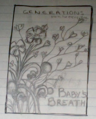
First Seed Packet (Baby's Breath)
These are the steps I took to reach my final design for my first seed packet.
Original Sketch for first seed packet - Baby's Breath
first finished design
changes made to first design
further changes made to first design
Final changes to first seed packet
Tuesday, September 20, 2011
Tuesday, September 13, 2011
Mind Mapping
Start with one idea and branch out from there to create a visual thinking tool that structures your information and helps generate new ideas.
My Mind Map
- I thought that the most interesting string was from growth -> change -> life -> babies -> baby food.
- I also thought that green -> recycle could create an interesting idea.
- I may explore this more when generating ideas for my seed packet design.
- All the ideas that were generated from summer could be another direction I could go.
- Frozen treats or beach related themes were most interesting to me in this string.
Wednesday, September 7, 2011
Logo Exercise
Draw the logos on either the left or right column using Illustrator's shapes and pen tools.
My Logos:
My Logos:
Subscribe to:
Comments (Atom)


